Seed Console Gets a UX Update
Today we are rolling out a major design update to the Seed console. In this post we’ll be going over the changes that are a part of this update.
Background
A few weeks ago we ran a survey asking for some feedback on the dashboard that we released back in March. One of the biggest pieces of feedback we received revolved around the UI of the Seed console. A lot of you found it confusing to navigate around, especially when looking to change the settings of the app. You also felt that it took too many clicks to get to commonly used features.
Internally, this has been on our radar for quite a while. The Seed console has slowly outgrown the original layout and structure. It was time for a much needed redesign.
The New Design
Here’s a quick comparison of the Seed console homepage.
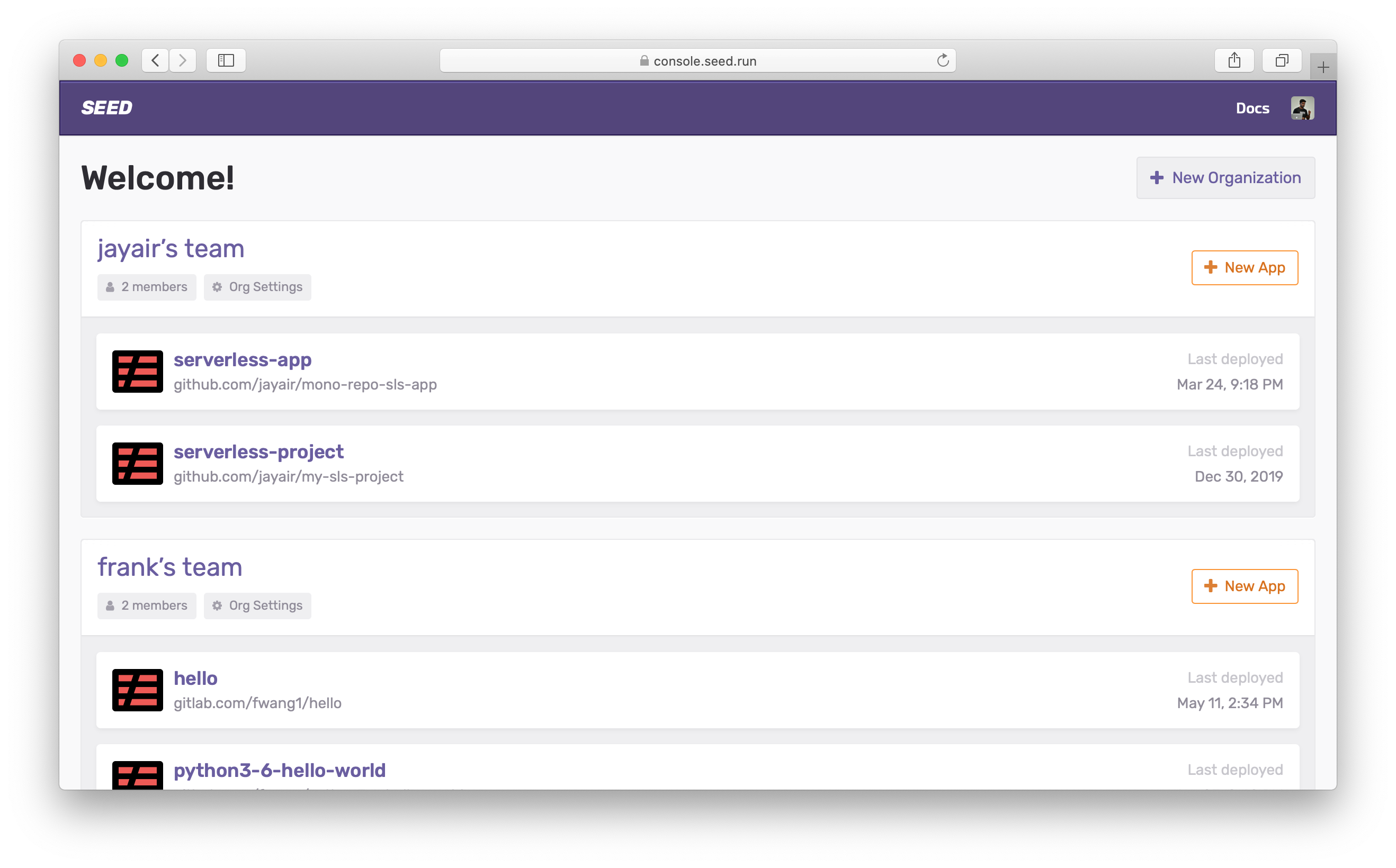 The new Seed console homepage!
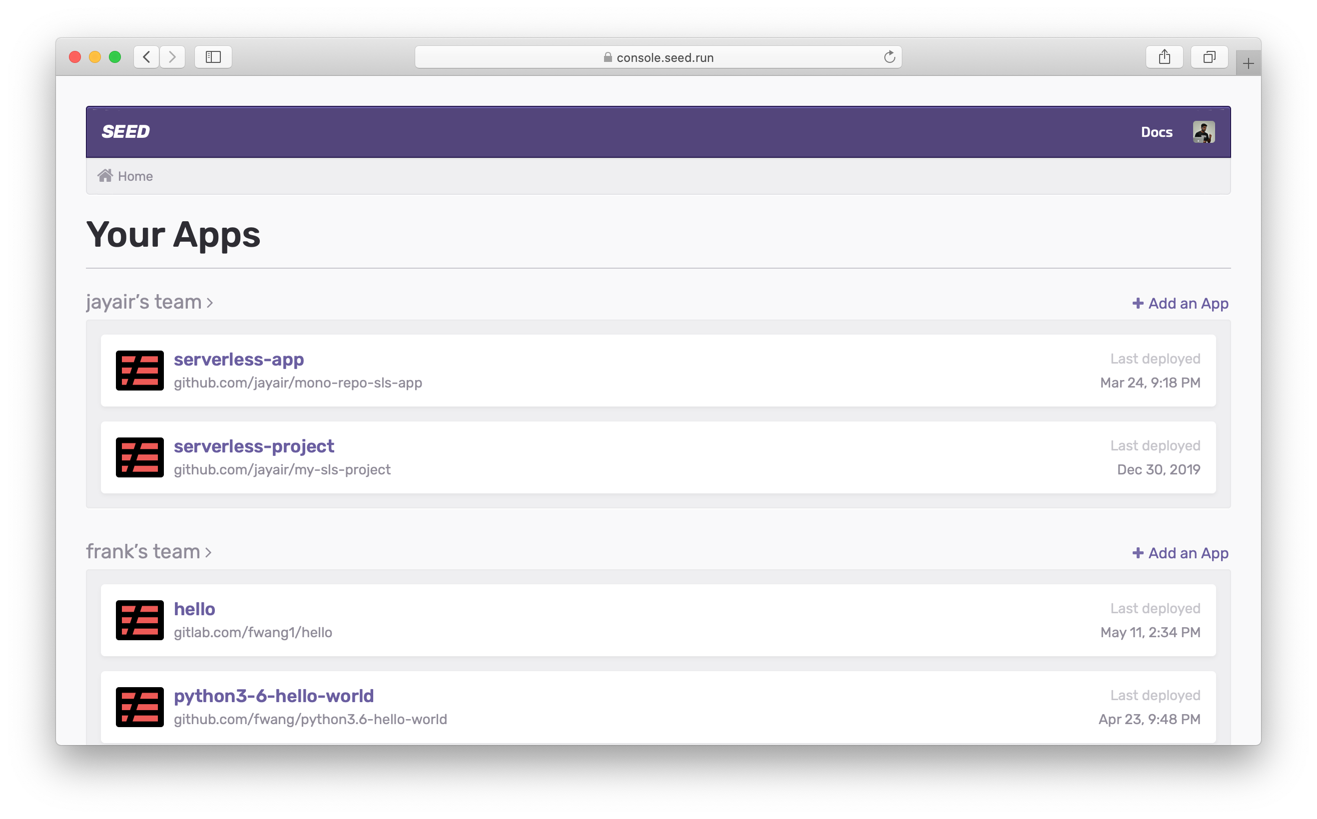 Compared to the old Seed console homepage.
Common Actions
The first thing you’ll notice about the new design is that there is a bigger focus on the most commonly carried out actions. This is a pattern that is applied across all of our pages. Also, it makes much better use of the screen real estate.
Navigation
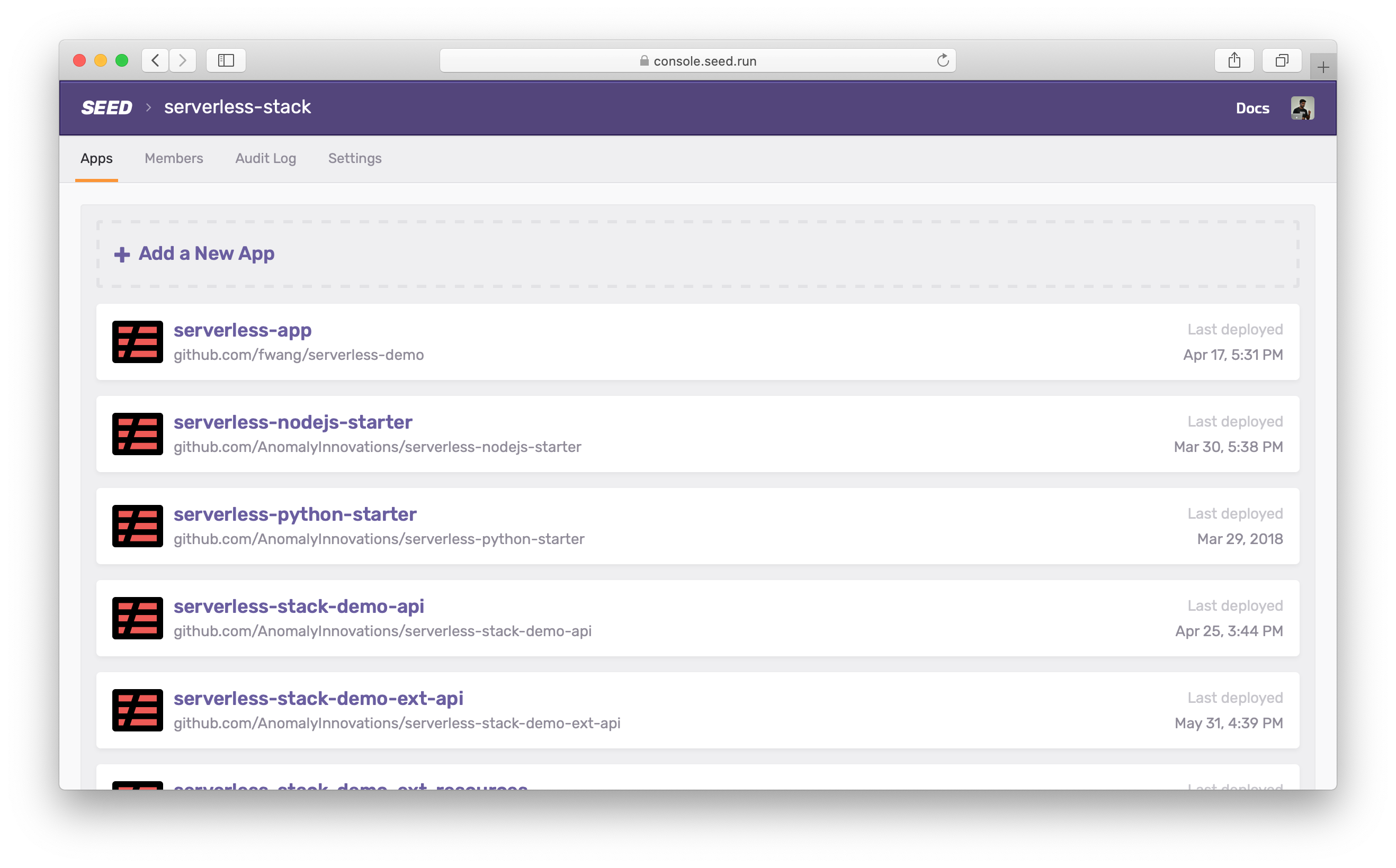
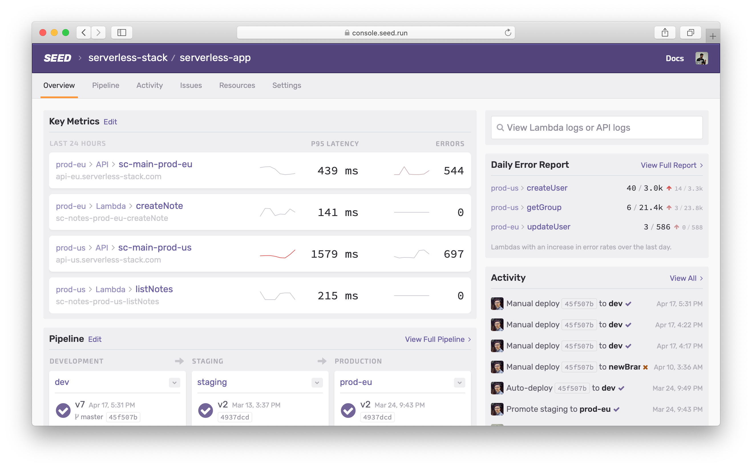
To address the issues around navigation, the new design has a persistent tab-based navigation for the organization pages.
And in the apps.
Breadcrumbs
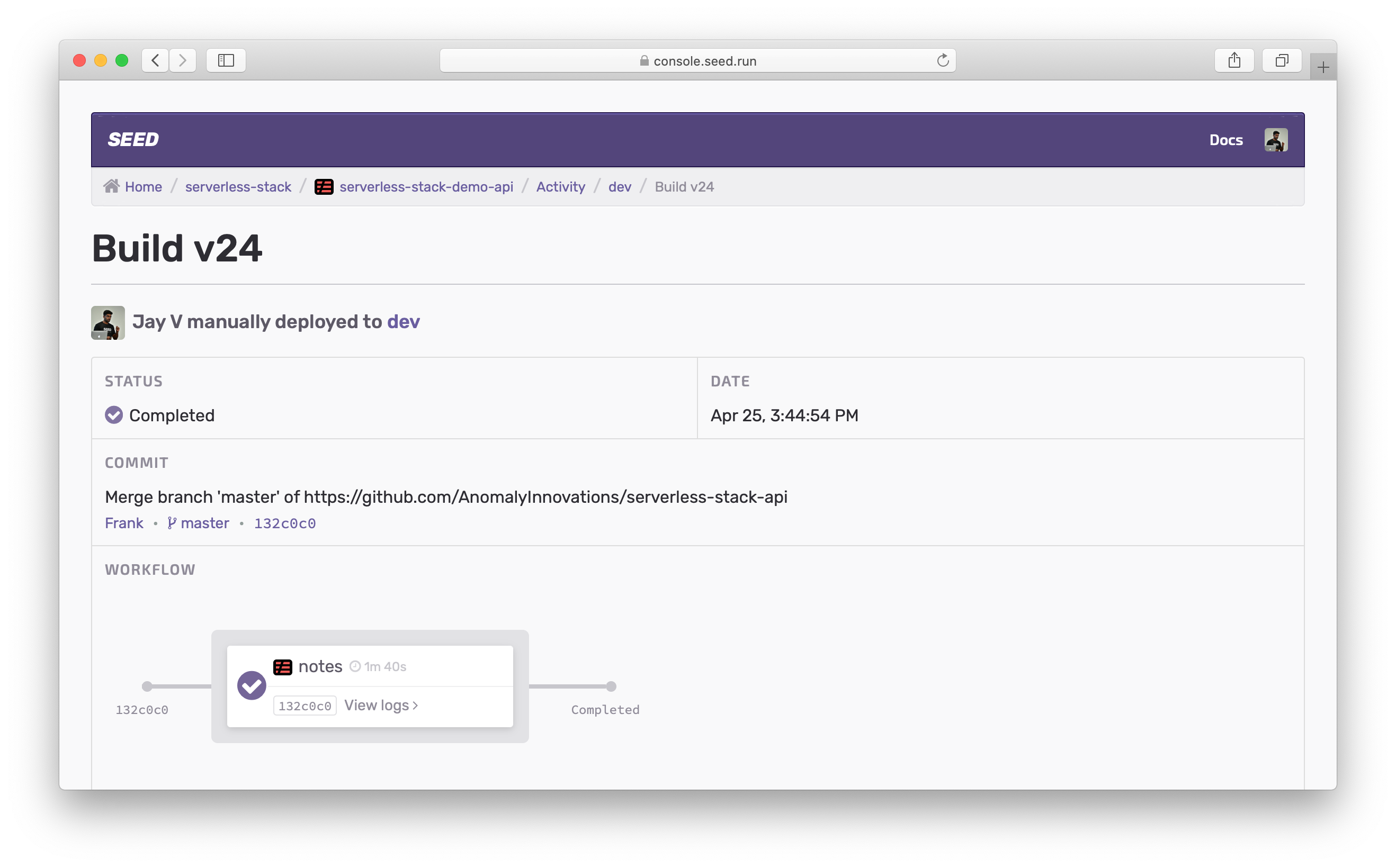
In the previous design the breadcrumbs were a constant feature of the UI. While they were ever-present, they were not contextual and did not help you find your way around specific sections of the console.
For example, the navigation below doesn’t give you a good sense of where you are in the app.
Whereas, in the new UI:
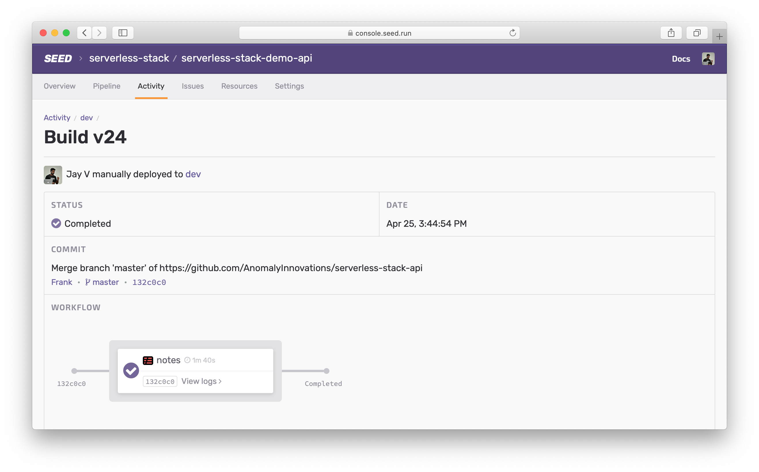
The breadcrumbs along with the tab-based navigation give you a clear sense of your place within the console. And the contextual breadcrumbs help you navigate within it.
App Settings
The app settings have been revamped in this update. The first thing of note here is that all the settings (stages and services) are a part of the app settings. And can be accessed in a single click from any part of the app.
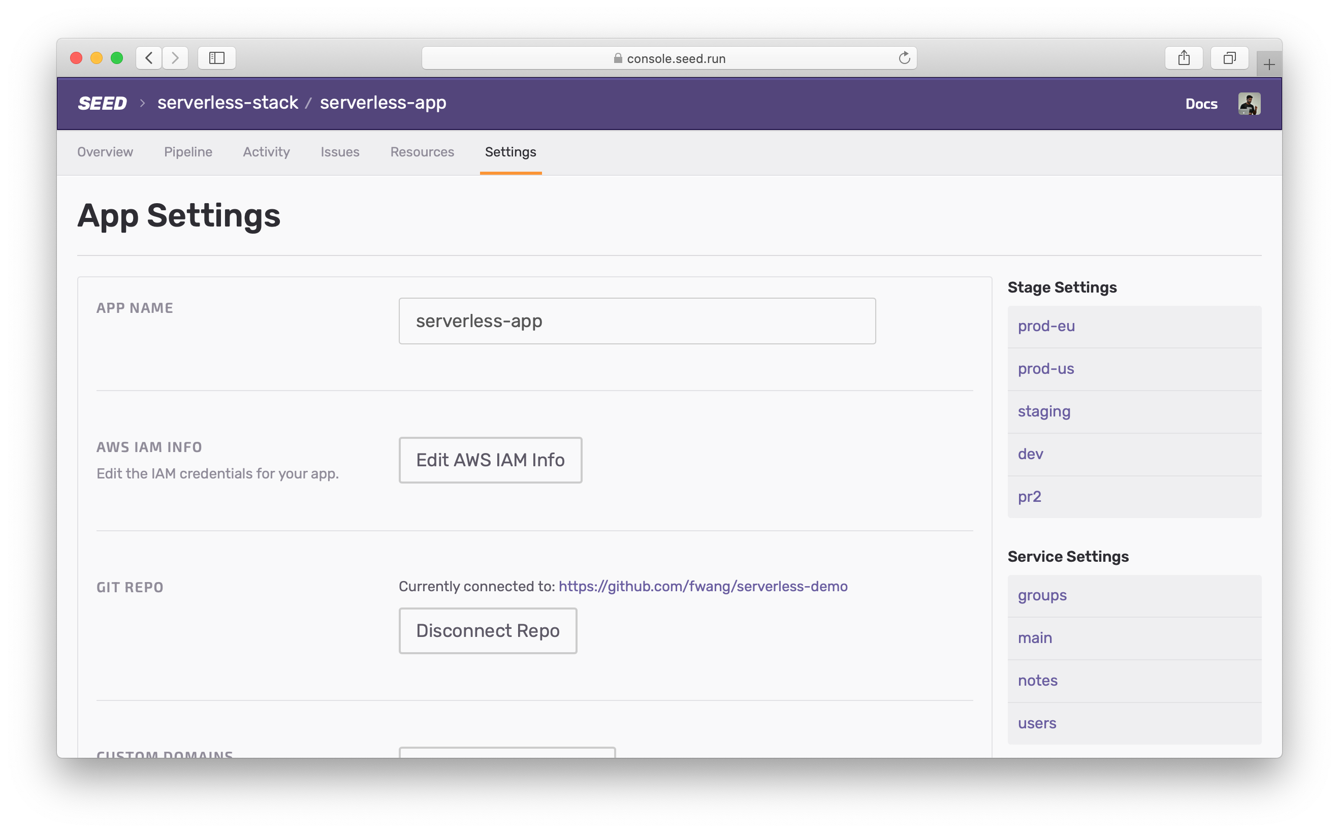
This means that you won’t have to click around to find that specific setting.
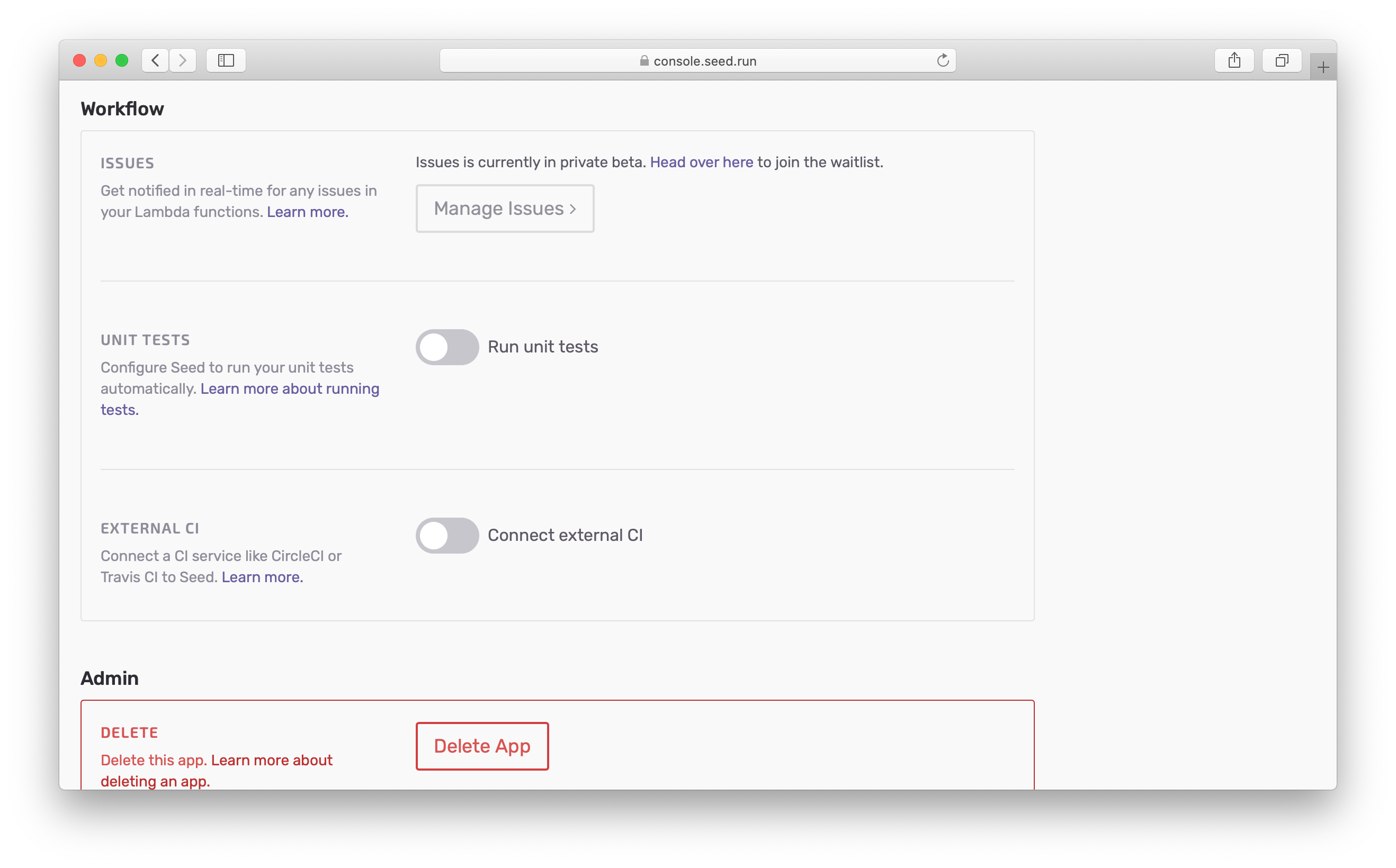
And many of the settings now feature a more intuitive, edit-in-place UI.
Managing Pipelines
Seed does a great job of helping you manage the deployment pipelines for your Serverless apps. And this design brings that into focus.
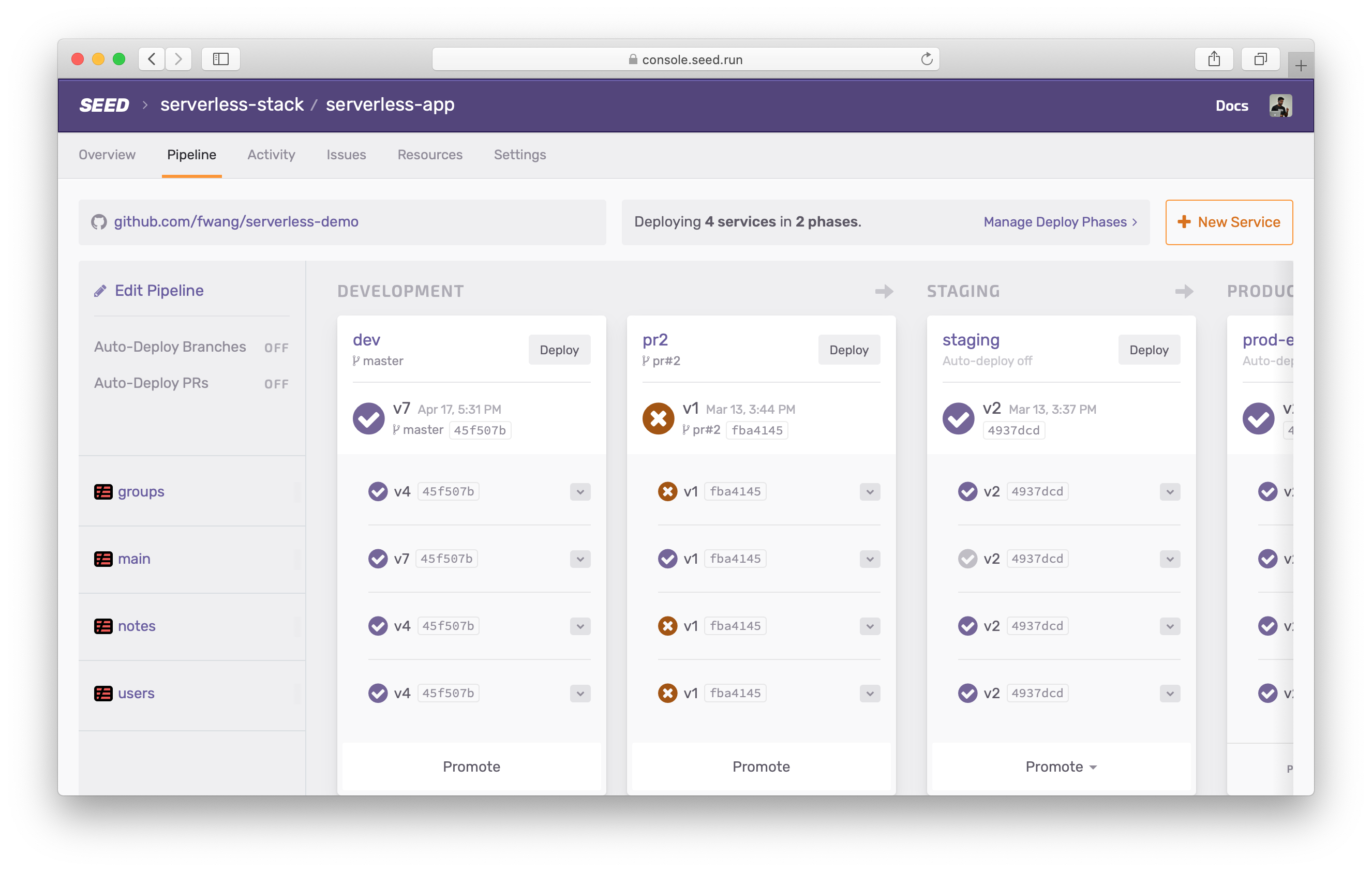
Here you get a clear view of the:
- Current state of the pipeline
- The Git repo that your app is connected to
- The deploy phases for your services
- And the auto-deploy settings
You’ll notice that clicking on the stage now takes you to the build activity for that stage.
On the other hand, editing the pipeline gives you easy access to everything you need to configure your pipelines.
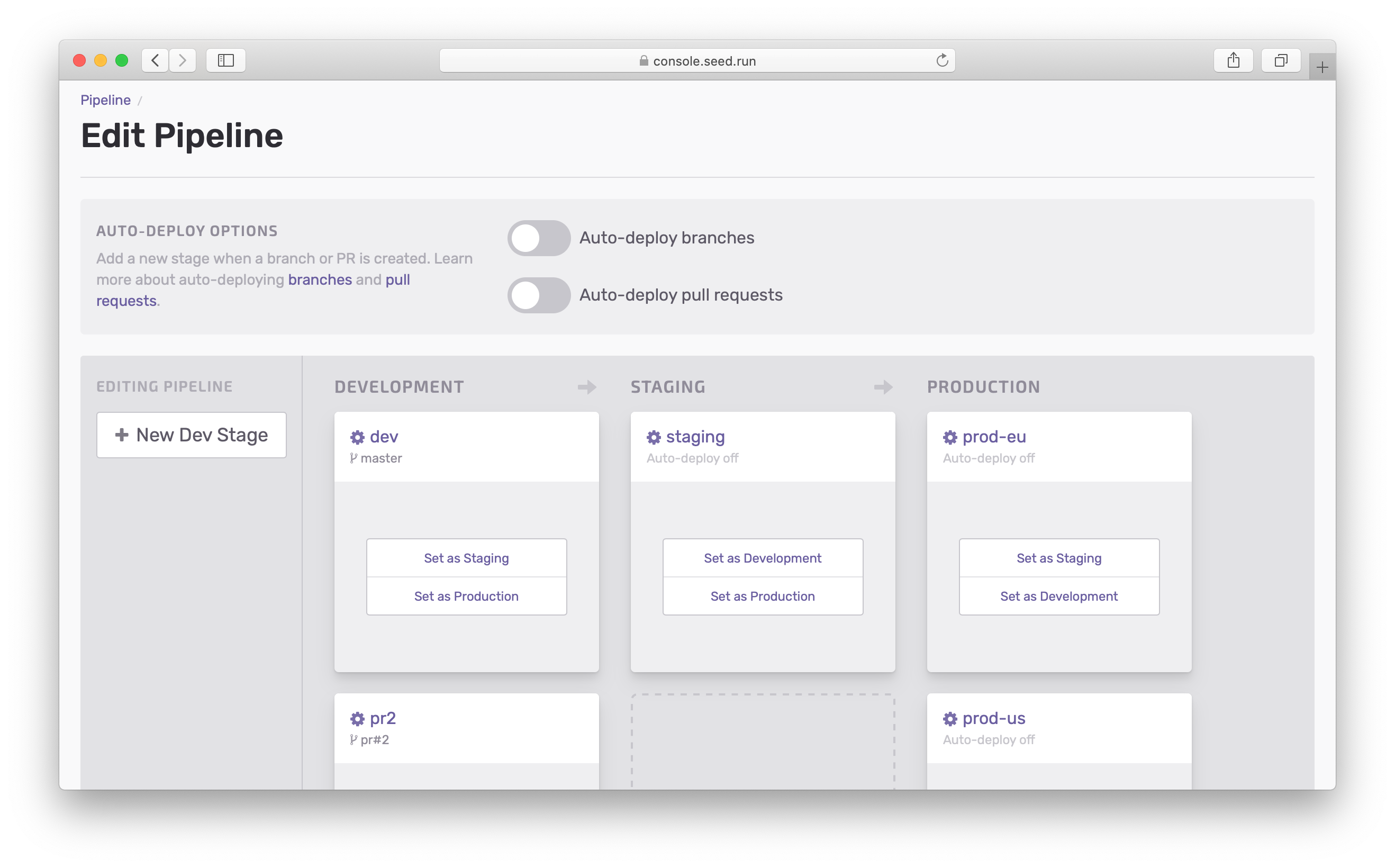
Here clicking on the stages, takes you directly to the settings for that stage.
Deploy Phases
A key part of the pipelines in Seed are the deploy phases and post-deploy phases. Previously, you had to configure them in separate parts of the console.
This new design brings them together. You can manage your deploy phases right from your pipeline.
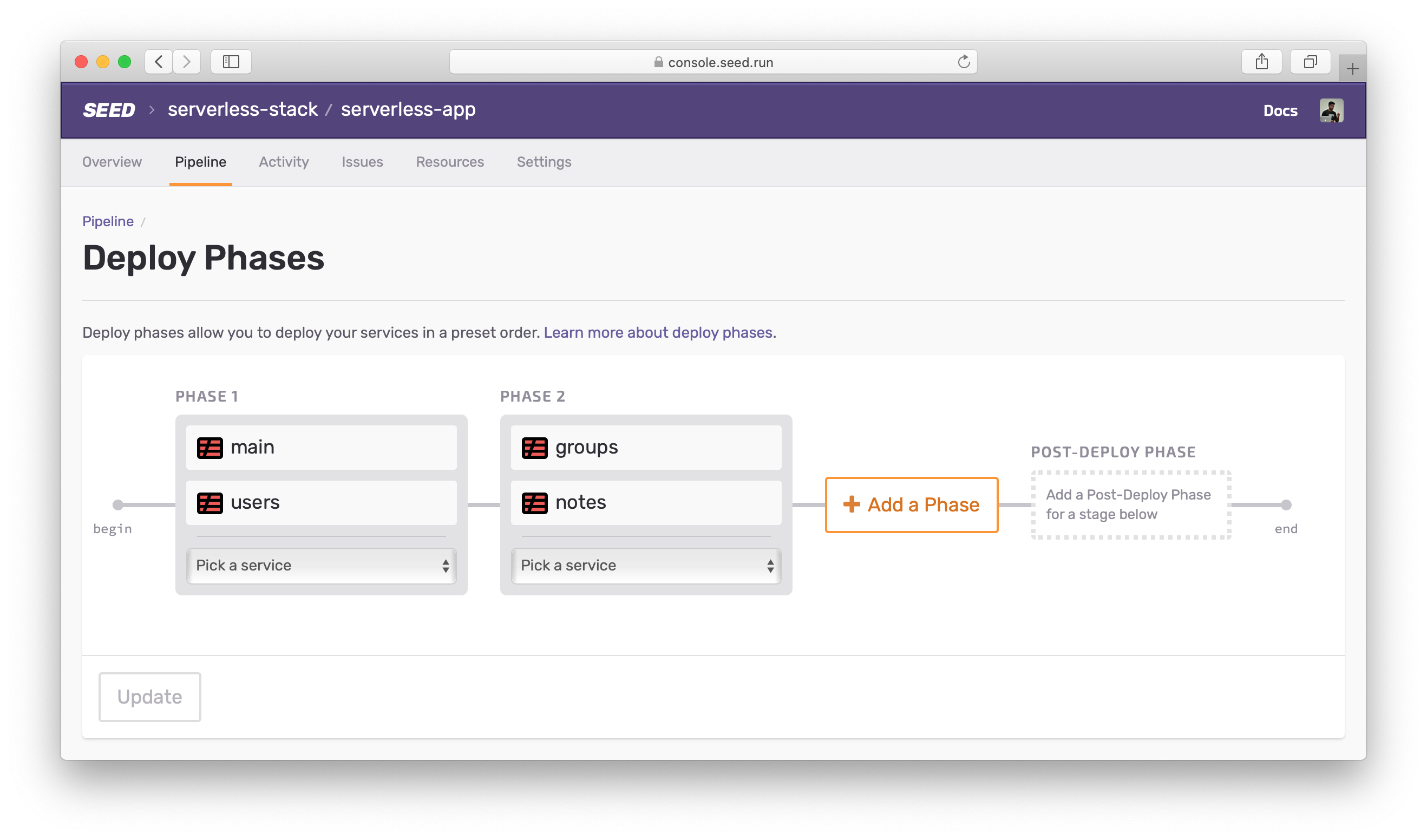
On the same screen, you can configure a post-deploy phase for all your stages!
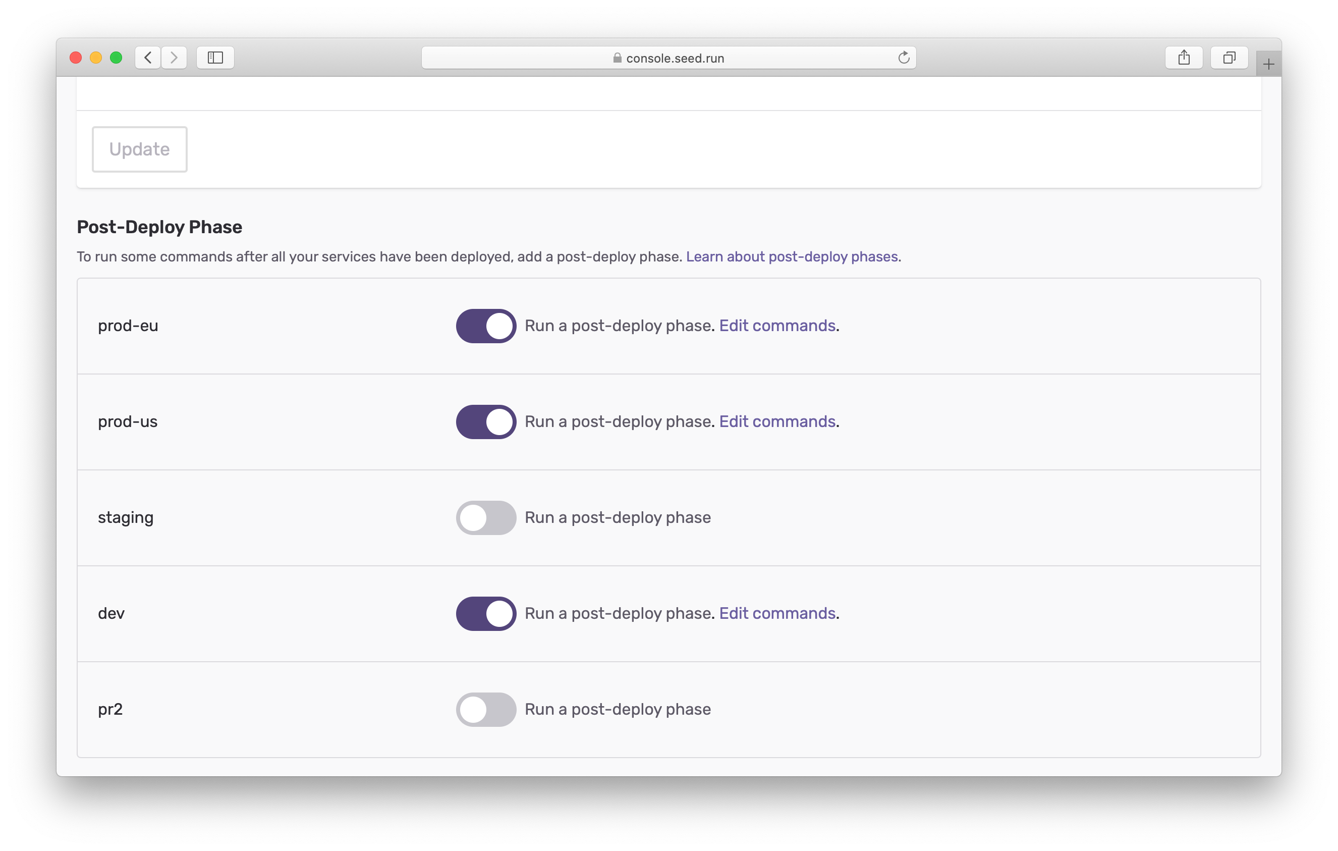
No more having to go from stage to stage to set it up.
Bonus
You might have noticed one new tab in your app pages — Issues!
We’ve got something amazing in store for you. But it needs its own announcement!
Closing
A big thanks to everybody for their amazing feedback. We hope this new update addresses the concerns (and frustrations) of the old Seed console. We would love for you to try it out and share your feedback with us. Feel free to contact us via the in-app chat or send us an email.
Do your Serverless deployments take too long? Incremental deploys in Seed can speed it up 100x!
Learn More